I read The Design of Everyday Things awhile ago. Since then I’ve noticed basic design principles that are either good enough or bad enough to draw notice. Sometimes it’s only in contrast with a better (or worse) design that you realize how bad (or good) a design is.
I came across a particularly illustrative example of this while we were rearranging our books after having purchased another bookcase. Occasionally when you buy a set of books they’ll come in a thin cardboard box. This is the cardboard box that a set of J.R.R. Tolkien books was packaged in:
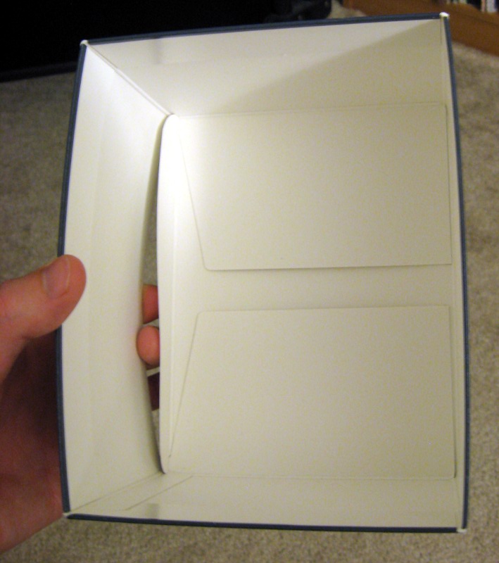
Notice how it’s built like many simple boxes with a flap that tucks in. You don’t think anything of it until the moment you attempt to slide a book in on that side. The cover hits the flap and you risk damaging the cover if you try to force it.
This is the design of the box that all of the 3-packs of books from the Wheel of Time series came in:
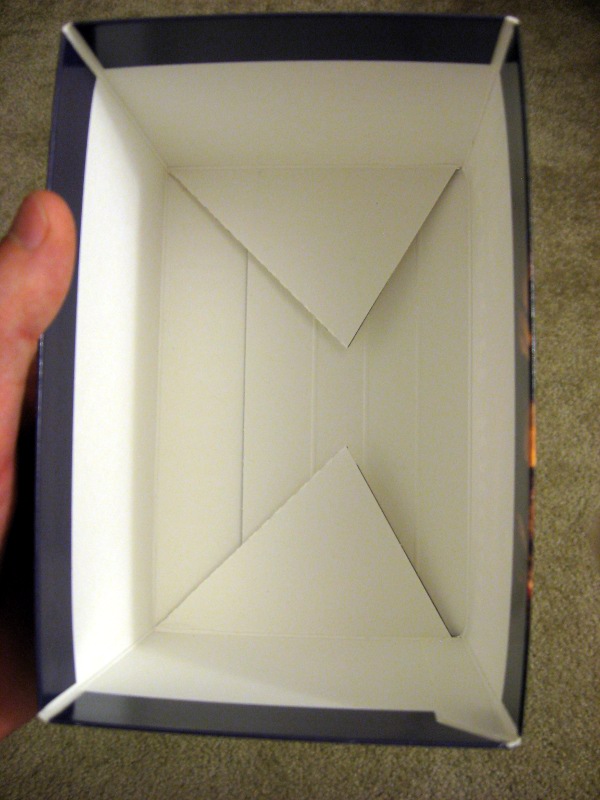
Specifically designed to have no flaps that might interfere with sliding a book back into place!
Since a lot of my work involves user interface design I try to pay attention to functional designs and pick out what is good or bad about them.
It turns out that it’s really hard to create good interfaces, which is why I try to appreciate them when I find them. It can be painful to watch users interact with some of the interfaces we put together at work. As a team we bend over backwards to make things as simple as possible—then you watch someone still completely fail to interact with the system successfully without coaching. It’s hard, but we’re really figuring things out and have been getting a lot of praise for our most recent designs.
If you’re in the application development world and you’ve never really watched an “average” person use a computer, you need to do it. You’ll have your mind blown by how kooky their actions are. It never occurred to me that some people will always drag-and-drop to copy/paste text. They do it because it’s faster than right-clicking and selecting copy and then right-clicking and selecting paste. But they’ve never learned that ctrl-c / ctrl-v is far more convenient. We made some people really happy when we made sure to account for this drag-and-drop behavior in our application. It wasn’t hard to do, we just never imagined it would be useful!
Your post about watching people do things you’ve designed reminded me of something that happened last week. I am in the process of doing a safety inspection on all our church buildings in the area. On Wednesday I was working in Goshen. Aunt Joyce was coming from Albany and meeting me there so she could come home with me to visit.
One of the things I have to check is first-aid kits. Most of the buildings have them mounted on the wall and they cannot me removed. The hinge is at the bottom so when you swing open the lid, the contents tend to fall out. Poor planning on someone’s part, in my opinion. I have consistently written this up as a problem along with the fact that is seems a first aid kit should be portable so it could be taken where needed.
But perhaps I was being too fussy. I thought I’d ask Aunt Joyce to try to use the first aid kit and see her reaction. It was not at all what I expected. The box was mounted high enough on the wall that she could not see the latch on top and she couldn’t even figure out how to open it, so having the contents spill out was not an issue. I was familiar with the kits so I knew where the latch was and it never occurred to me that someone wouldn’t even be able to figure that much out. It was pretty comical watching her grope around the box trying to find a way to open it but it did point out another unanticipated problem of mounting them on the walls.
P.S. Please excuse the typos in the previous comment.